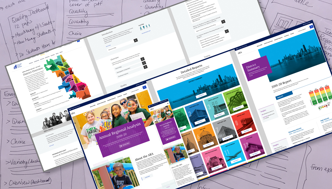

The client wanted to create a website that provided Chicago Public Schools’ families with information about school quality, enrollment patterns and program offerings in their communities, as well as to empower them to work with their schools to apply for new investments that best meet the needs of their children. The Annual Regional Analysis site delivers this information in an interactive and accessible format that is available in eight different languages. I provided visual design and photo research as part of a team that included stakeholders, a marketing manager, another designer and a developer for this 23-page site. Do know that the site may be in development.
VIEW SITEThe client needed a completely new marketing website for Chicago Public Schools’ families that provided information about school quality, enrollment patterns, and program offerings in their communities. They also wanted to empower families to work with their schools to apply for new investments that best met the needs of their children. The site would contain large amounts of data for each of CPS’ 16 regions within its district. Each region was to have its own page. Initially, the direction from stakeholders was to follow the look and feel of an existing printed brochure. As the project evolved, however, we also needed to include the look and feel of CPS’ new home website which was being designed at the same time.
I worked as a UI designer as part of a team that included another UI designer, the marketing manager, a developer and stakeholders. I started with rough sketches to make sure I was creating a logical architecture for the site as a whole. From there I moved onto wireframes which were periodically shown to stakeholders who provided feedback. As I incorporated the feedback and made iterations, I moved the wireframes into high resolution visual designs for desktop and mobile. I worked closely with the other UI designer and the developer to ensure the design consistently followed changing brand guidelines while maintaining ADA compliance.
After reviewing content with the marketing manager and stakeholders, I began rough sketches to determine a coherent architecture. Due to the nature of the content and the large amount of data, I determined the best way to showcase this information would be through drop-down accordions where users could control what topics they saw.
When I felt that I had strong rough ideas I put them into wireframes. We started with the District Overview page first. This page’s design would be the template to follow for each of the 16 regions’ pages. I presented my first set of wireframes to the client. We regularly met with stakeholders and as we iterated I moved into the visual designs.

While we were iterating wireframes and moving toward visual design, the design for CPS’ home page was evolving as well. As modules, styles and components were finalized, they were provided to us to incorporate. With a deadline fast approaching, the other designer and I split up the final pages and collaborated closely over Slack. We provided InVision files for the developer and also collaborated with him on Slack.

I really enjoyed working on this project. Initially, it was a lot of information to process. It took a little time for the other designer and me to understand how it all worked together. It was also a challenge to have a new brand introduced when we were deep into the design process. However, everyone at CPS was very nice and helpful as questions came up. We met the client’s deadline without incurring overtime charges and the stakeholders are quite happy with the new site. Do know that the site may be in development.
VIEW SITE