The client approached me with a request for a cloud storage product. They felt the market had room for another player, provided the right features combined to meet the needs of a specific audience. From my research, there was definitely a market for a medical information storage app. I provided research, design and testing for the project.
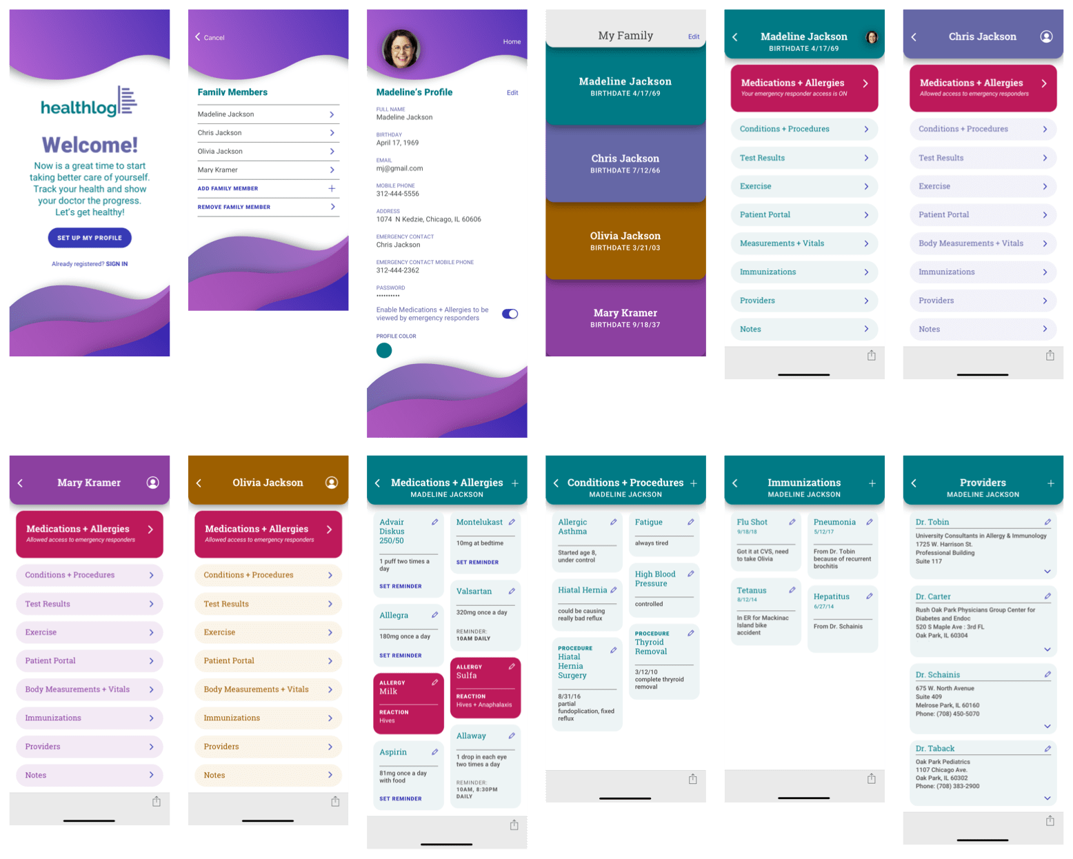
VIEW PROTOTYPEThe client wanted a unique solution for a cloud storage project. My research showed me a healthcare information storage app would be a good solution. There are few apps in the marketplace that store and organize your complete medical information. The iPhone has a health app that is pretty detailed. I felt I could do a better job organizing the information to make an app that was simpler and easier to use.
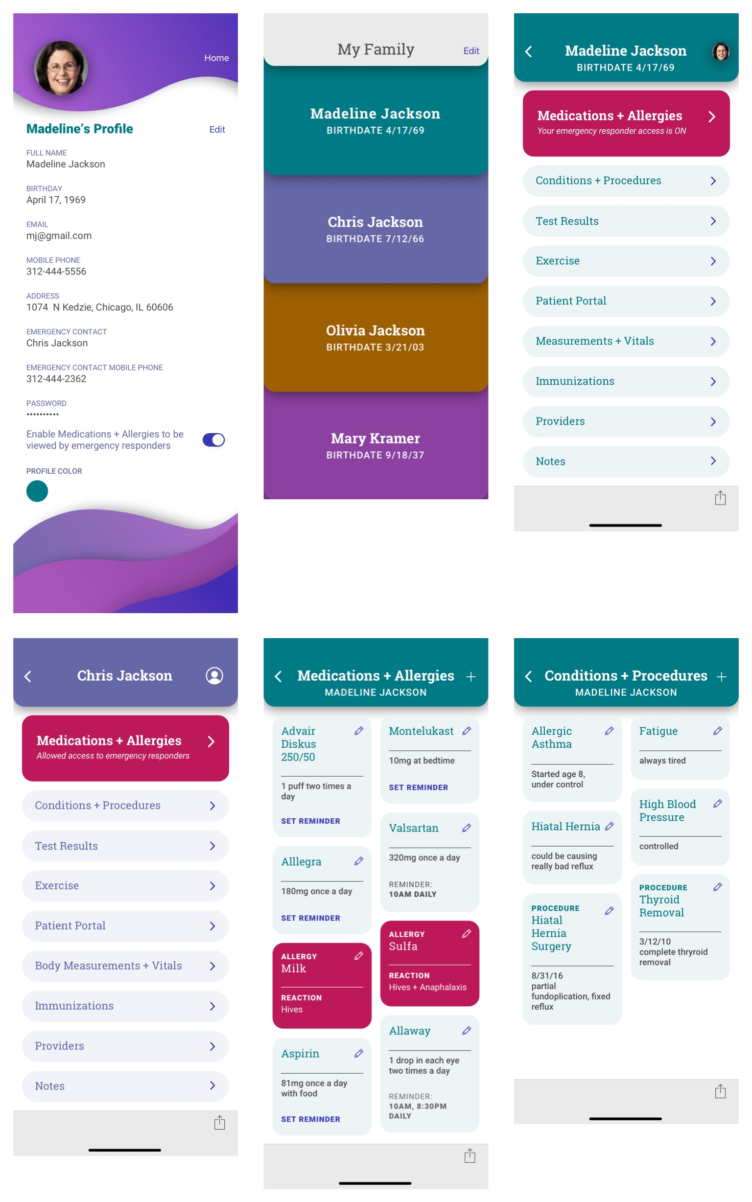
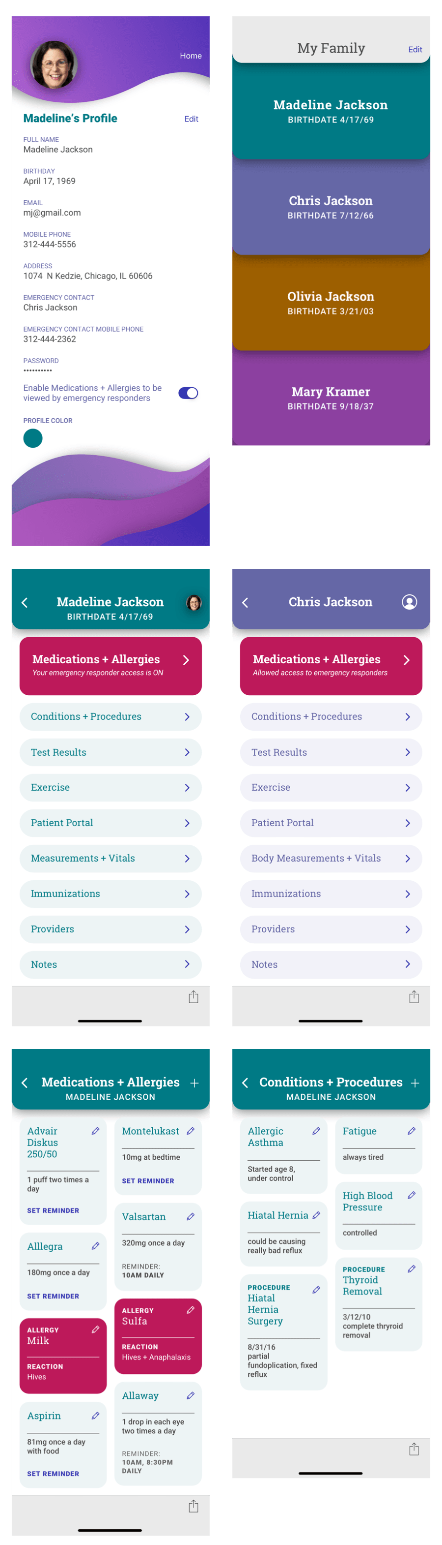
Apple’s health app is has a lot of details but it doesn’t have clear organization and category names. It’s also only available for one user. I created a solution that would work for many users. It allows organizing and sharing of medical information, provides medication reminders and permits emergency responders to view medications and allergies.
My research showed more iOS users than Android so the app was built for iOS. I also discovered many people have health related apps on their phones, mostly to track exercise. Folks are good about going to the doctor, many visit several. Many people take medication for one reason or another, which is unfortunate because half of the survey respondents were under 30! I found almost all surveyed would like all their medical information in one place. Some features respondents wanted are exercise, body measurements, medications, medication reminders, doctor contact information, appointments and lab tests.
93% of people surveyed would like all of their medical information to be in one place.

Goals
Frustrations
Motivations

Goals
Frustrations
Motivations

Goals
Frustrations
Motivations
I analyzed three competitors – Capzule, Andaman7 and the iOS Health app. These three apps have similarities like name, age, medications, allergies and emergency contacts. Yet, none of them left me with a positive user experience. I found each of them frustrating to navigate.
VIEW SWOT ANALYSIS
The user flow process for Andaman7 and Capzule were significantly more lengthy and confusing than Apple’s Medical ID. Onboarding, categorizing and saving were all lengthy for Andaman7 and Capzule. Apple’s editing feature was jumpy, the app kept moving to the top of the page when adding data. It also is significantly smaller than the other two apps and has much less capacity to hold data. There is definitely room for an improved health record storage app in the marketplace in addition to patient portals which are normally only edited by doctors and healthcare professionals. This kind of app would allow a patient to store all of their medical information in one place.
As a [user role] I want [goal] so that [benefit].
Based on my survey responses, I included the following user stories that have the most priority:
After having a difficult time navigating through Capzule, Andaman7 and the iOS Health app, I knew this app needed a clear hierarchy with intuitive, easy navigation.
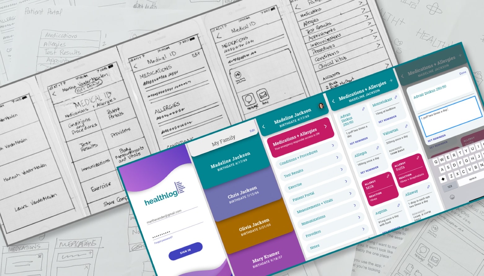
VIEW USER FLOWSWith user flows in place, I moved on to putting my ideas into sketches. This allowed me to try different ideas before deciding on one.
VIEW SKETCHESI learned a lot from user testing my wireframes. I asked users to:
Users didn’t see the words Medications + Allergies under the Medical ID title. Some of them went to Patient Portal. So I changed that language. I learned the app needed a stronger identity and promoted more in the marketing landing page. I needed to determine the best way to add and edit content. One user couldn’t tell the categories were clickable so I addressed that in my visual designs and preference tested it.
VIEW WIREFRAMESI struggled with the name and logo a little. At first, everything I tried seemed trite. I couldn’t decide if this app was going to be called Healthplus or Healthlog. I felt Healthlog was a more accurate description of the app but I didn’t feel any of my logos were strong representations for it. Then I recalled a logo I’d worked on for a previous project that was never used. I really liked this logo and felt with a couple tweaks, it would be a fantastic solution.
I played with different fonts. Ultimately, I felt raleway was the best solution. It evoked a positive, simple feeling which is what I wanted my app to be. Medical problems aren’t positive. This app needed to counter that in any way that it could.


Pulling from a previous healthcare project, I had purple and teal in mind as colors. They needed to be bright and positive without appearing inappropriate. While researching images for my moodboard, I discovered a layout that I could incorporate into my app. It gave me the idea to assign different colors to different users. So, I chose two more colors that would complement the purple and teal. I suggested the palette below but then gave users the option to choose their own color choice for their profile.
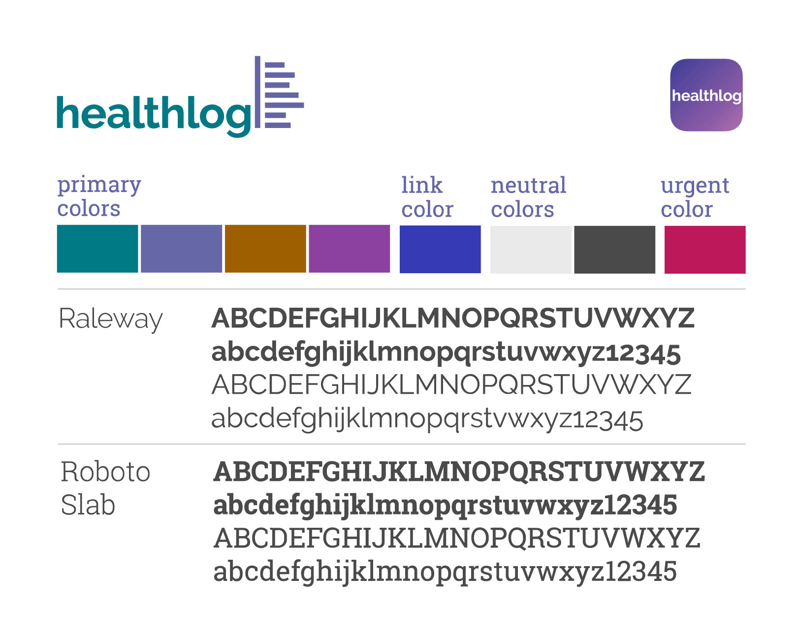
In order to help the logo stand out, I chose a different font from Raleway for the app, landing page and any other collateral. I chose Roboto because it paired well with Raleway and had many different styles which would help contribute to the hierarchy of the app.
VIEW STYLEGUIDEArmed with colors, fonts and layout ideas, I moved onto mockups. I carried each user’s color choice through their part of the app. It was at this stage I decided to add two more colors for any links and the medications + allergies section which could be enabled to be seen by emergency personnel. I added profile pictures and determined when to use icons and when to use text for links and editing. As the corners of shapes were rounded, I went with rounded buttons to be consistent. I felt the rounded curves throughout the design created a softness that would contribute to the positive feeling I wanted to evoke.
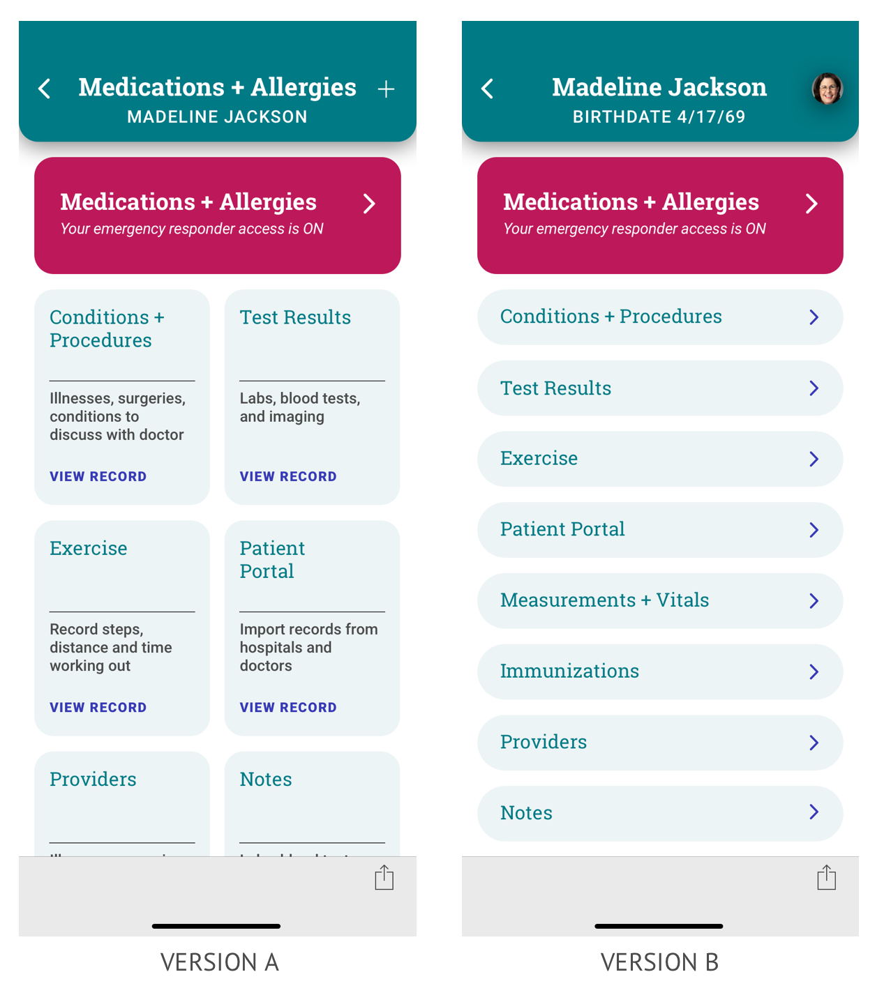
In response to my wireframe tester’s comment that the categories did not look clickable, I designed 2 user dashboard layouts. I ran a preference test to determine which layout was preferred. I preferred version A but users liked the quick read of version B.
To complete the app, I added account and profile screens, a marketing landing page and the app icon. I did a preference test for the icon to decide between just the list portion of the logo or just the name. The name was preferred. Everything was ready to be tested.
VIEW PROTOTYPE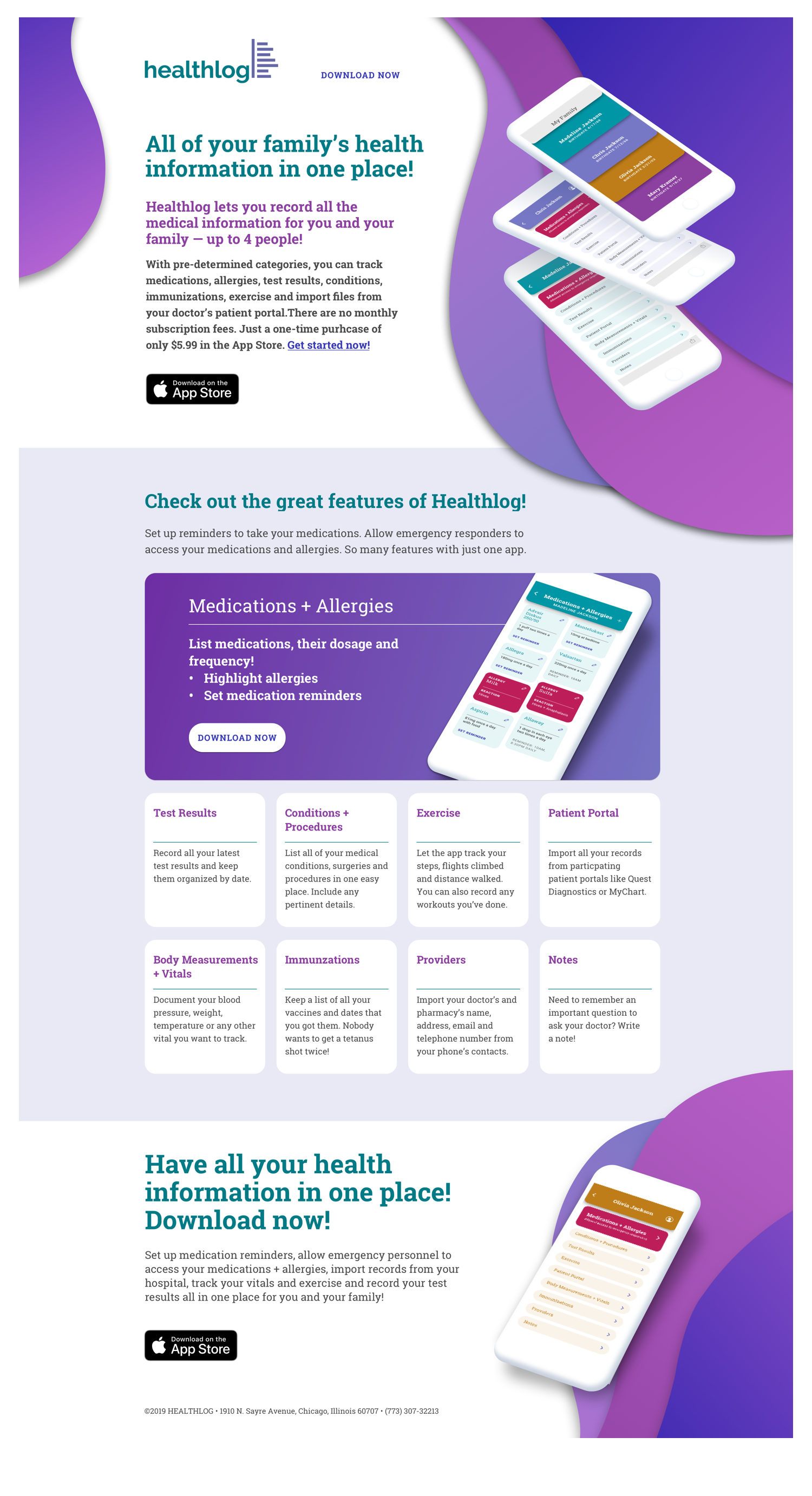
I ran three final tests asking users to:
Everything went as intended. One user wasn’t sure if the share action would send the record to the doctor. Another one suggested I take a closer look at color contrast. Since the other testers were quick to go to the share button to send the record, I didn’t make any changes. I did, however, update colors to pass AA accessibility for not just larger sized text but normal sized text as well.
The most important thing I learned is the importance of testing. I’ve been a designer for a long time and I had some strong feelings. But that’s not what this process is about. It isn’t about which design I prefer, it’s which one the user prefers and why they prefer it. I can make assumptions all day but unless those assumptions are tested and proven, they’re not valid. I was so sure my first dashboard design was it. Visually, I felt great about it. But the testers preferred a more concise view. It wasn’t all for not, however. I was able to use that layout elsewhere in the app.
If I’d had more time, I would have liked to work more on the animation. I did some research but couldn’t quite find a quick way to accomplish it. It would require more time than I could give unfortunately. I did, however, communicate to the developer the interactions I would like to see.
In future projects, I’m definitely going to take advantage of the preference test. It’s super fast, you don’t need a script, it’s free and you can do it on your phone! It’s just too simple not to do it – and it can bring important changes to your project.