The client was interested in an app, but they had a few ideas in mind. After some discussion, they decided an app to hold rewards cards was a good idea. From my research, there was definitely a market for such an app. And how convenient would it be for people to take out all those rewards cards weighing down their wallets! I provided research, design and testing for the project.
VIEW PROTOTYPEThe client wanted to create an app but wasn’t sure what kind of app to make. My research showed me that an app to hold your rewards cards would be a good solution. There were not many apps that do this in the marketplace and some of them were just awful. I knew I could create a solution that was simpler and easier to use.
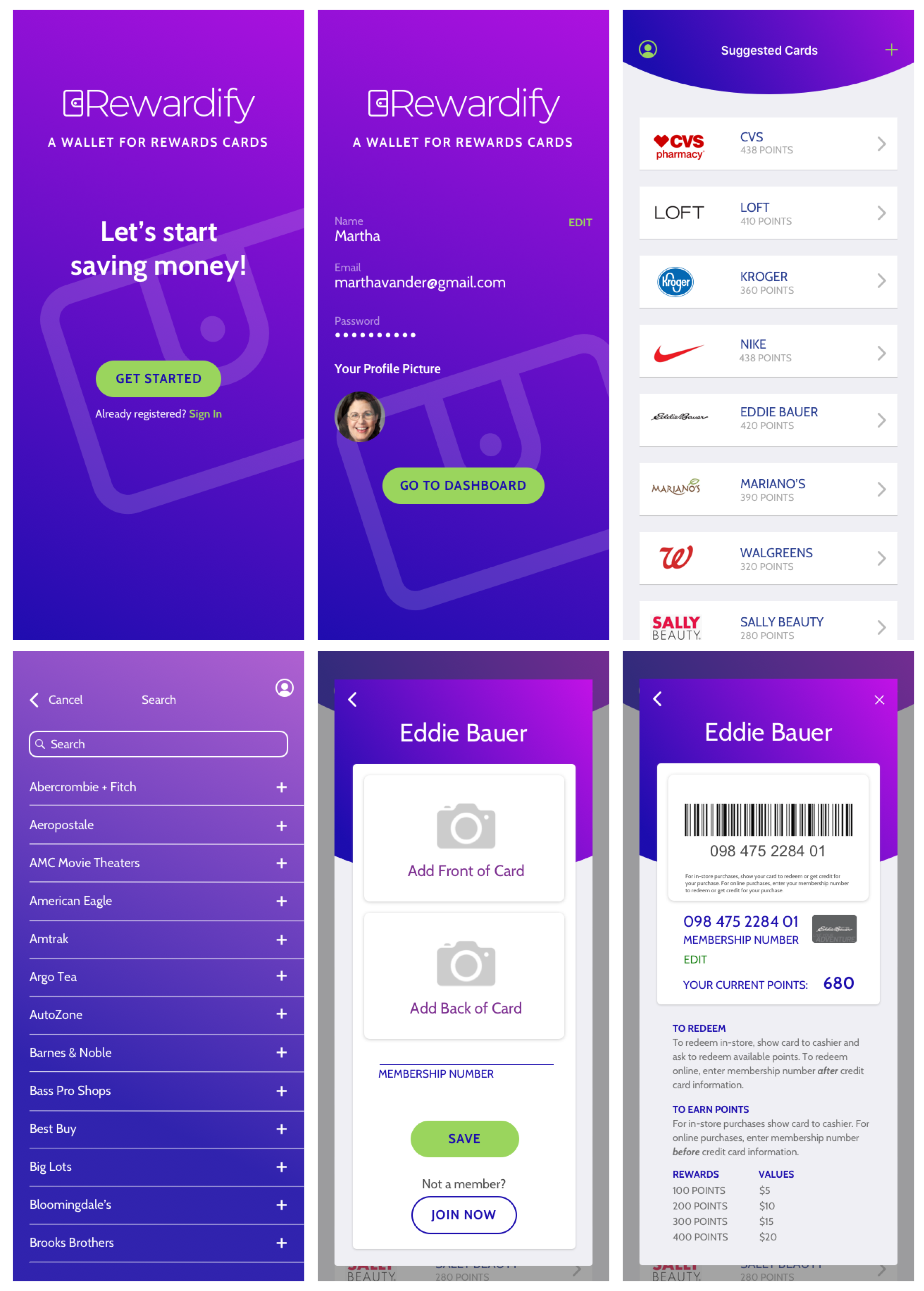
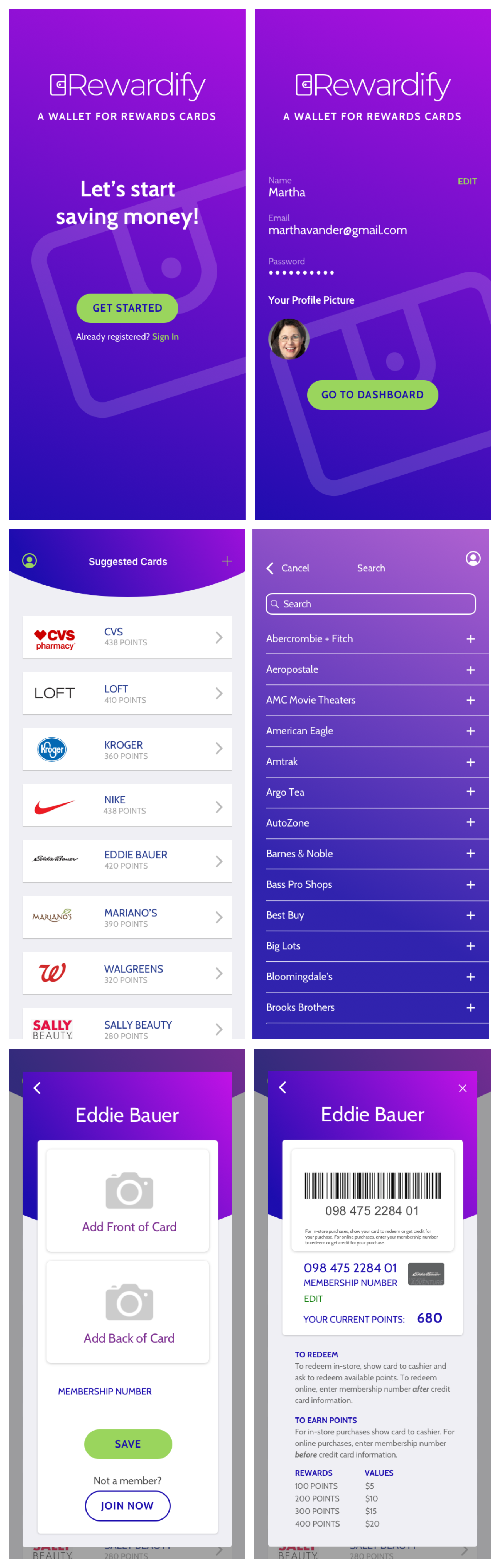
I developed an app that was simple and easy to navigate. It can accommodate any participating retailer (or restaurant) and has the capacity to link to the user’s rewards account with that retailer to let the user know how many points he or she has available to use.
The first thing I wanted to establish was that most people are heavy smartphone users. 97% of respondents use a smartphone and almost 90% of them use them frequently. The next thing I wanted to learn was how often do folks shop at a nationwide chain and what their thoughts were about stores that offer rewards. 91% of respondents felt rewards were a good idea and 53% said they would be more likely to shop at a store that offers rewards. 78% of respondents provide their phone number to get rewards credit and say they are able to check their rewards balances. The folks who aren’t able to check their balances have to ask a cashier when checking out.
78% of those surveyed said they would use an app that managed rewards for multiple stores.

Bio
Matt has three teenage sons who are into really into sports. He feels like he spends half his life and ALL his money shopping for new athletic equipment. A few months ago he signed up for a rewards program at Dick’s Sporting Goods. One day when he was checking his email, he learned he had enough points to get a free putter!
Goals
Frustrations
Motivations

Bio
Maria has always been frugal. She runs her own psychology practice and is saving to retire before she turns 65. Last year she signed up for the rewards program at DSW. When she recently when shopping for rain boots, she learned she had enough points to get them for free!
Goals
Frustrations
Motivations

Bio
Gabriella has been paying for part of her college expenses since she was 18. It’s been hard but she’s making it work. She recently signed up for Mariano’s rewards program to save money on groceries. When she went online to see how many coupons she could get, she was amazed. She would save $15 dollars on her next trip!
Goals
Frustrations
Motivations
I researched Key Ring, Stocard and ReceiptPal. Key Ring and Stocard were similar in that you could add your rewards cards. ReceiptPal would only let you load receipts but you could earn rewards by submitting those receipts.
VIEW SWOT ANALYSIS

Key Ring has a lot going on, which can be good or bad. Its UI is bad because it’s hard to read. They need to increase their font sizes and change their colors. Their navigation was also not super clear. They had a large plus sign which indicates to add but there’s no text to make it clear. Stocard was much simpler than Key Ring but its UI was very stark. It included retailers offers and sales but they weren’t unique to users and they didn’t correspond to the user’s cards. ReceiptPal was very different altogether. You could store your receipts in it and submit them for points. However, to get a $5 coupon for Amazon, you had to scan 22 receipts. There is definitely room in the marketplace for a rewards card app that is only about rewards. It needs to sync with retailers’ rewards accounts and have a clear and simple, fun interface that is easy to navigate.
As a [user role] I want [goal] so that [benefit].
Based on my survey responses, I included the following user stories that have the most priority:
After having challenges using Key Ring, Stocard and ReceiptPal, I knew this app needed a clear hierarchy with intuitive, easy navigation and a fun user interface.
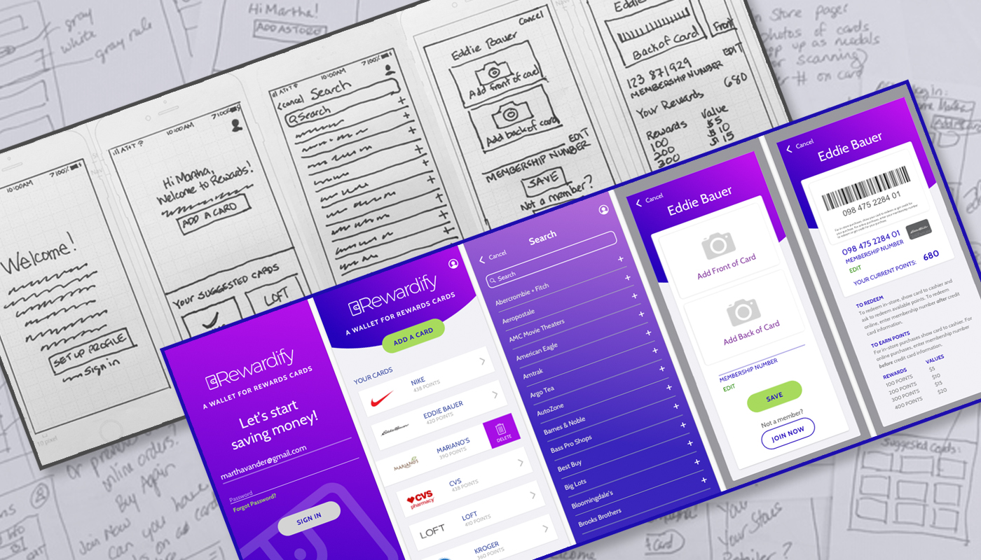
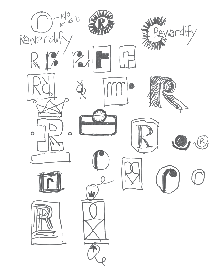
VIEW USER FLOWSWith user flows in place, I moved on to putting my ideas into sketches. This allowed me to try different ideas before deciding on one.
VIEW SKETCHESWhile doing the sketches I realized that a QR code wouldn’t be needed because rewards cards normally have their own barcode on the back of the card. The navigation was challenging for me. The app is very simple, I felt I had to make it more robust. No, it doesn’t need to be anything else. It’s an app that holds rewards cards. It tells you how many rewards you have at each store and allows you to quickly launch the card when you are ready to pay. With all this in mind, I moved onto creating my wirefraes.
I started with a name. The first idea I had was Rewardz, but I didn’t like that. So I did some searching and found a site that helps you name things using prefixes and suffixes. I liked Rewardify because the suffix ify means to become or to make something become. I thought that was the exact idea of a rewards card so my app was named Rewardify.
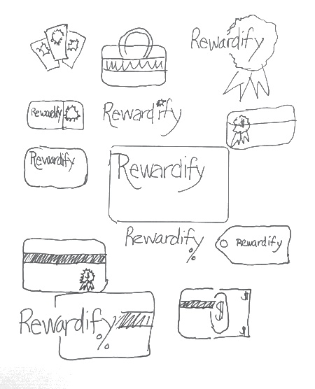
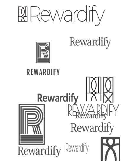
I played with different fonts and icon treatments. I ran a preference test between the three images below. Logo A was preferred. However, one of my stakeholders didn’t like its icon. Since my description of the app is “a wallet for rewards cards” I changed the icon to a wallet.
I wanted the colors in my app to be bright and fun. For the app’s main font, I wanted to use a sans serif font. Since the logo was also a sans serif font, it had to look very different so I decided on Cabin.
VIEW STYLEGUIDE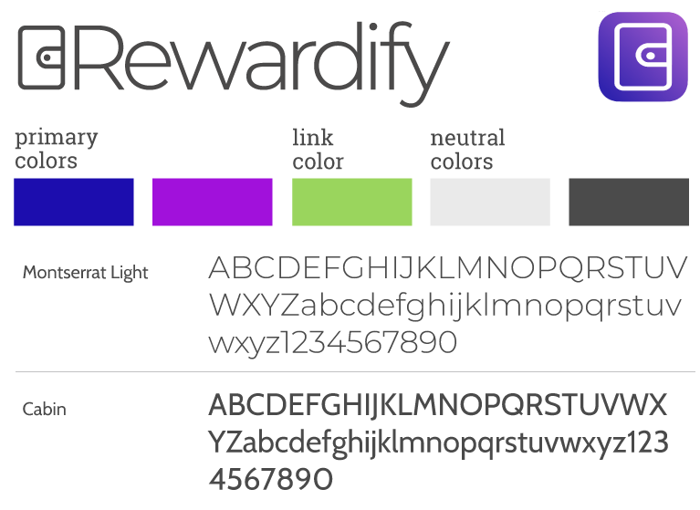
Ready to go with fonts, colors and layout ideas, it was time for visual design. I incorporated gradients and a large, screened back version of the wallet to add a sense of fun. The bright green color for the CTAs and text links also added to this feeling. The cards held the retailers’ color logos, company names and number of points. The logos helped contribute to the quick readability which might be needed when the user is in a hurry to launch their card for the cashier to scan. I followed the iOS human interface guidelines so there are no surprises for the users. I also ensured the colors and text sizes passed AA accessibility.
VIEW PROTOTYPE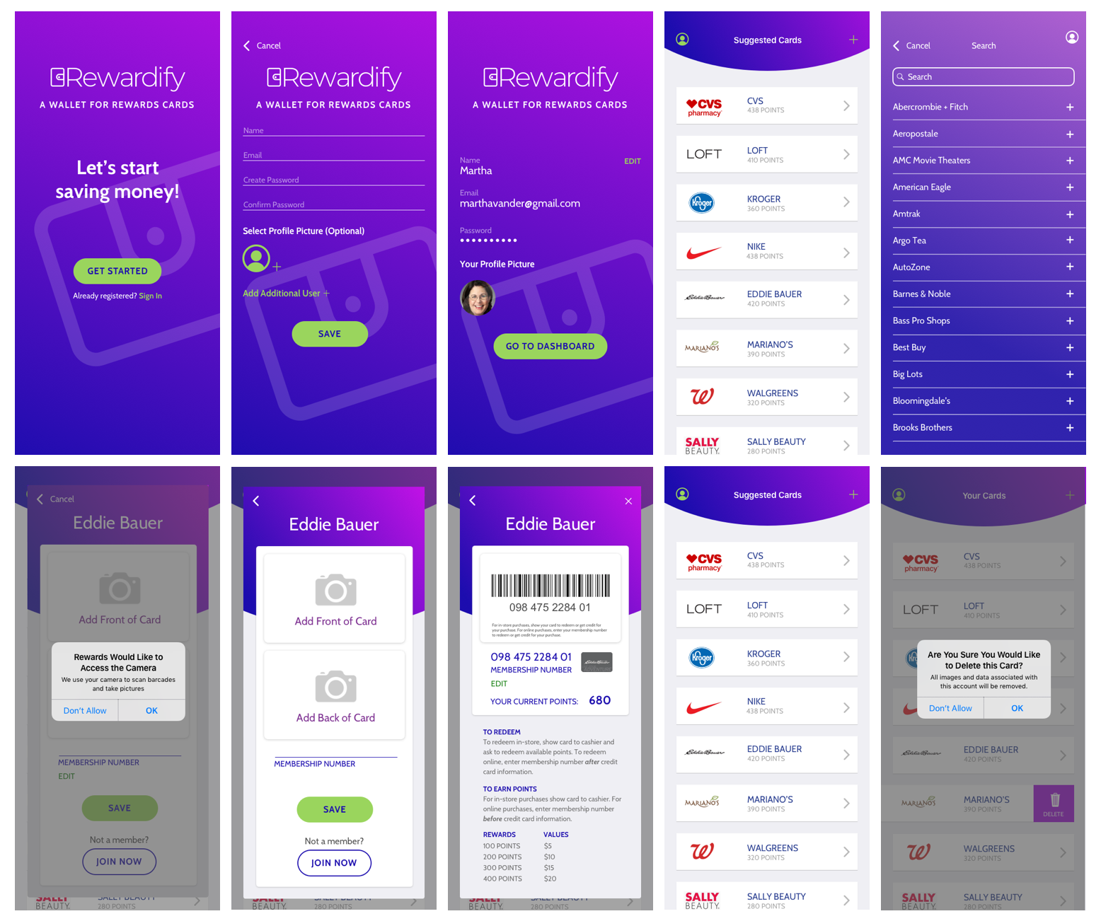
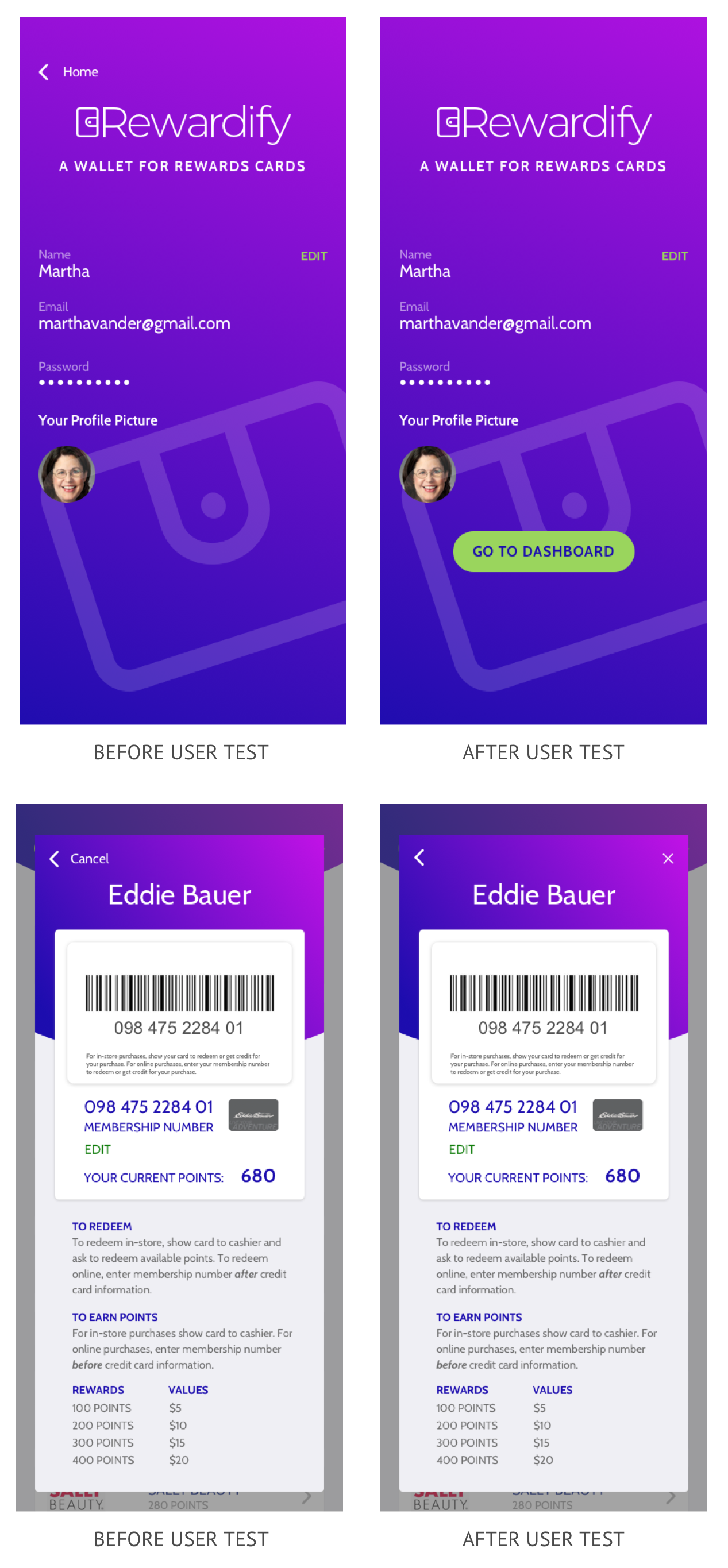
I ran three final tests asking users to:
The first tester had some issues with navigation, mostly with returning to the dashboard screen. I added a go to dashboard button on the saved profile screen so the user could easily get to their cards. For a completed card modal, I made two changes in the navigation. Once the user has added a card and saved its information, an x appears in the top right to close the modal. Moving forward, a home icon appears where the x was so the user knows it will go back to the dashboard. I also changed the order of the access camera screen to appear after the user clicks on the add front or back card icons. I repeated the user test two more times and both times the testers navigated the app easily and had no issues.
The most important takeaway for me is to test test test. For this project, it helped me solve some navigation issues that I wasn’t sure how to solve. The testing provided me those answers. I also incorporated feedback from the stakeholders in this project. They weren’t completely satisfied with the logo and felt it was important the app appear fun. I edited the logo by replacing the icon with a wallet icon. I ensured the app was fun by using bright colors, gradients and curved shapes. It was important that the app be simple and fast so the user could access their card in a rush while shopping.
If I’d had more time, I would add animation, as long as it didn’t slow the app down, such as when setting up a profile. I feel it would add more playfulness to the experience.
It is always important to test. A preference test is one fast, easy way to do that. Interviewing people using the app is also very important and can bring important changes to your project, ultimately making it more successful.