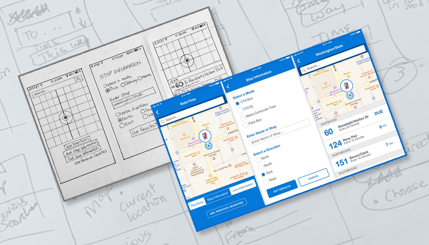
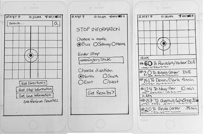
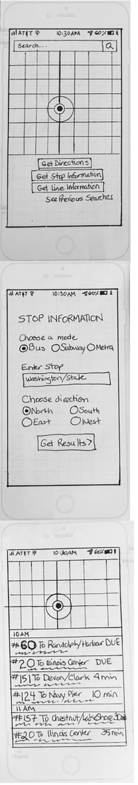
RiderTime is a Transit app. Public transportation officials in Chicago have added many bus routes. This has resulted in several different routes coming to the same stop. Riders want to know what the next arriving bus is and how much time they have to get to the bus stop. The solution that I felt would be effective was a stop information screen. Riders select the stop information button which takes them to a screen where they enter the stop information. They click get results to go to the next screen which lists the bus routes and how often they came to that stop.
VIEW PROTOTYPERiders want to know what the next arriving bus is and how much time they have to get to the bus stop. Rushing to the stop because you see a bus coming is frustrating when it’s not the bus the rider wanted. Riders are complaining the most about the bus stop at Washington and State, which has seven bus lines serving it.
I started with a screen that offered the rider a choice of getting directions, stop information or line information as well as previous searches. When the rider clicks stop information, they are taken to a new screen that requests information about the stop. When the rider clicks get results, the list of routes and how often they run appears. Screens 1 and 3 also have a map that identifies the rider’s location.
Most people take a bus, subway or commuter train when using public transportation. The frequency of taking public transportation is split fairly evenly between all the time, seldom and every so often. That makes me think you’re a regular user or don’t use it much at all.
This survey got responses from all age groups. I feel apps are a great way to utilize public transportation.
Clearly riders are getting a lot out of their public transportation apps. One thing most people are not able to do, however, is to pay the fare through their app.
I analyzed two competitors – Transit and Google Maps. These apps have similarities like providing you the best way to get from one place to another on public transportation, but they also had unique differences as well such as driving directions, which might not matter to people riding public transportation.
VIEW SWOT ANALYSIS
If a new transportation platform wanted to enter the marketplace, I would give them these suggestions:
Based on my research, I included the following user stories that have the most priority:
Google Maps and Transit displayed how much time it took to walk to a bus stop, when the next bus was leaving and when a bus was leaving several hours later. They both did a good job showing that, although Google Maps did not have a special alert for it unless you made one within settings. What struck me was that they did not have information about what the next bus was to approach a stop. And what was the best way to convey that? The solution that I felt would be effective was a stop info button. It would be separate from an alerts button. Once selected, the stop info button would allow the app to list the next busses arriving and their expected times as well as any other important information.
Steve Krug, a noted UX author, created a standard user testing script that I modified for RiderTime. Since I was using paper prototypes, I did my tests in person. I asked my users to do these tasks:
I chose 3 user testers who were regular public transit riders and who used apps to help them get to their destinations. All three located the stop information button on the first screen and agreed that’s where they would click to determine what the next buses were to arrive at their stop and how long it would be before their bus got to the stop. They understood they needed to enter the name of the bus or train stop in the next screen.
I took note of my users' observations and thought about how I might apply them to the next phase of the project, a high fidelity visual design:
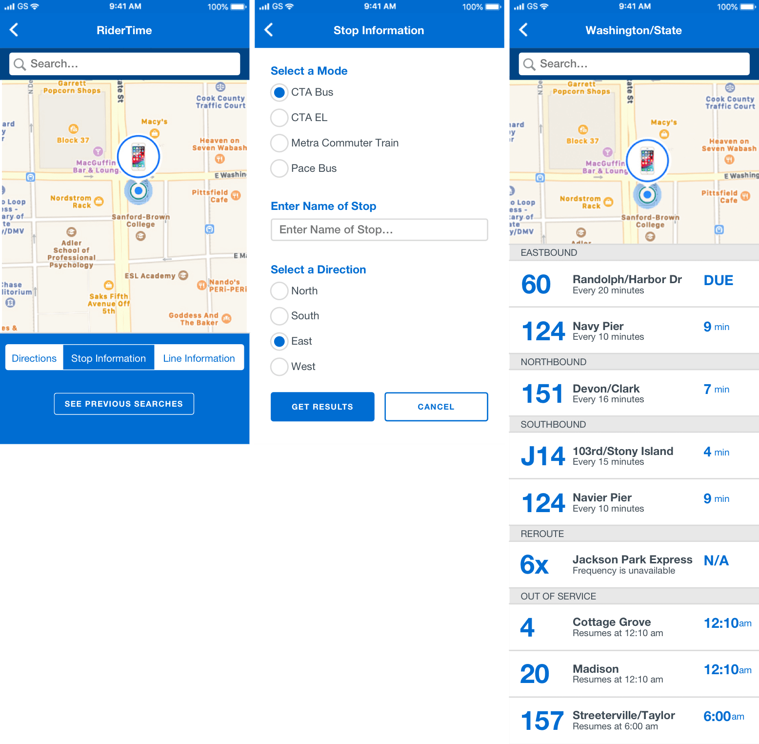
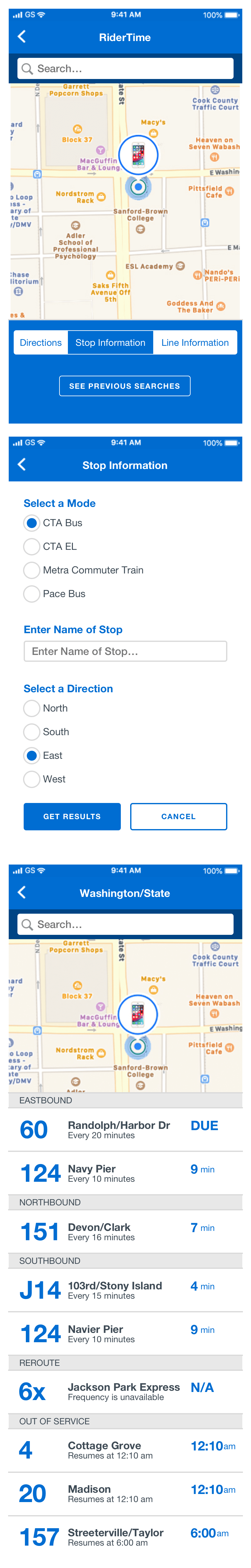
Having a map on the screen tells us exactly which Washington and State bus stop is being used, which is the northbound one. A list populates the screen that tells what bus is approaching the stop and how often it comes. I chose a bright blue because it’s one of Chicago Transit Association’s colors and it’s seen a lot on the buses. The sans serif font allows for clear readability. The bus numbers and minutes away are large and bold for quick and easy recognition. The client did have content to use for the smaller type and it was approved to move to development. This is a great way for riders to know when their bus is coming with a quick, easy read.
VIEW PROTOTYPEPublic transportation riders are in a hurry. In large cities, like Chicago, they might have long commutes. They don’t want to waste their time waiting for the next bus or train. And they don’t want to rush to a bus stop only to find that the bus they were chasing wasn’t theirs. It’s important to understand the riders’ perspectives, what their pain points are and have the ability to empathize with them.
It would have been easy to redesign an entire app, but that’s not what the client was requesting. It would’ve been easy to generate the perfect app with lots of great features. But that would have been very out of scope. It’s important to understand the specific problem to solve in a product so time and money isn’t wasted.